Cover photo: Waterhouse – Joe Paffoon
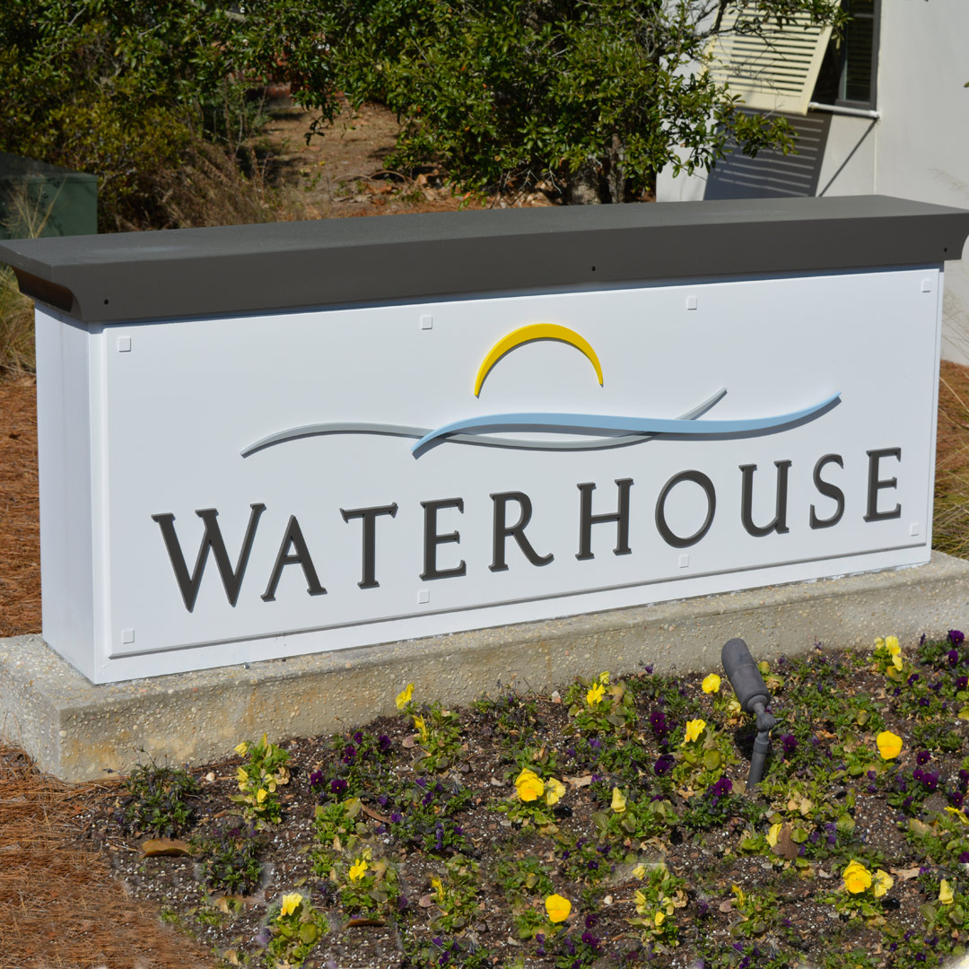
A monument sign delivers a much different look and message than a sign panel mounted between two posts. The additional mass of its… Read More

A monument sign delivers a much different look and message than a sign panel mounted between two posts. The additional mass of its… Read More
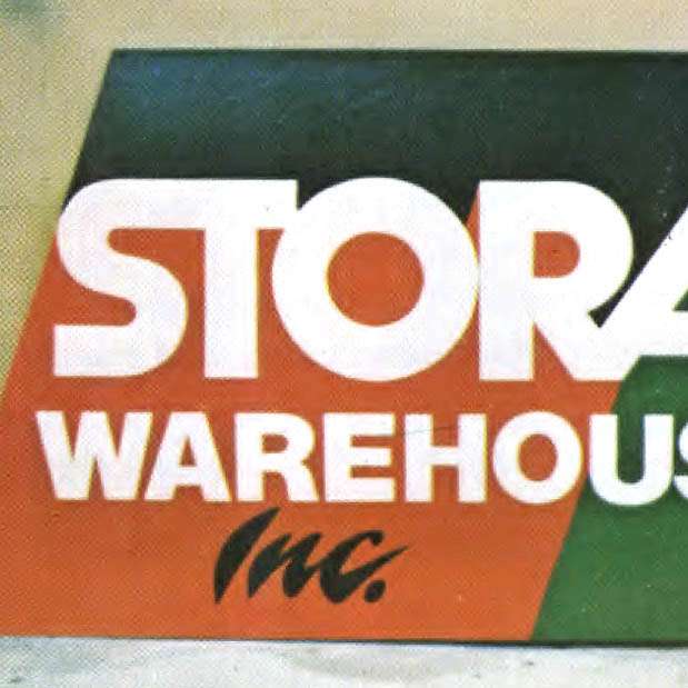
Back in the late 1970s and early ’80s, you couldn’t talk about sign design in a sign shop for very long before Chester… Read More
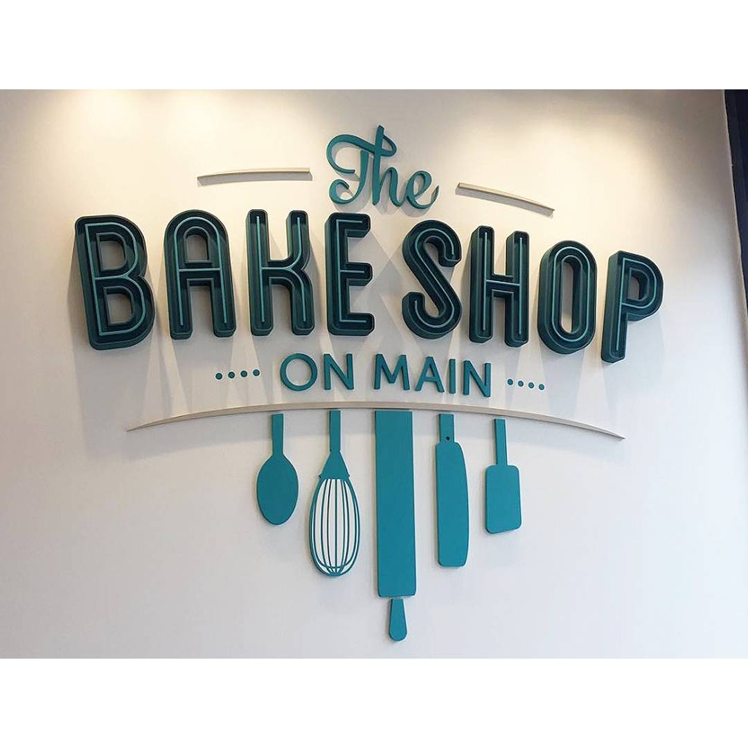
Sometimes a high school job can lead you to a lifelong career. That’s how it worked for Adam Straus, whose high school co-op… Read More
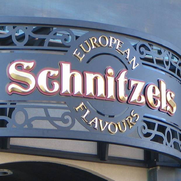
Cut-out letters can transform the building itself into a sign, turning the building into the background. Individual letters are a popular way to… Read More

It goes without saying that the primary message on a sign should be obvious. Make that “really obvious.” Bob Behounek likes to devote… Read More

You don’t have to look very far these days to see the latest trend in graphic design. You’ll find very clean, very simple… Read More

The cover story of the first issue of SignCraft back in 1980 was a feature on the signs of Sanibel Island, Florida, and… Read More
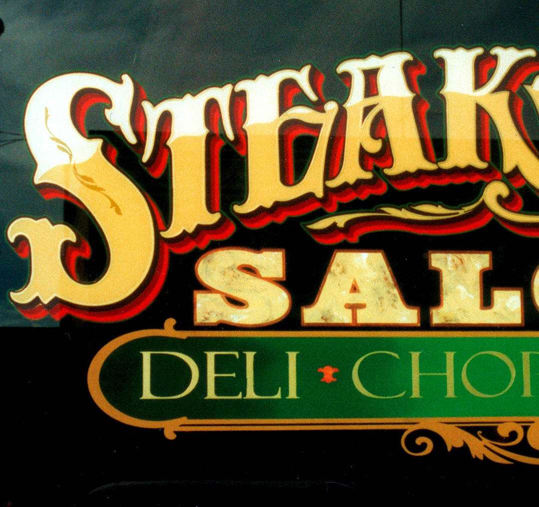
Dan Seese, Dan Seese Studios, Fort Collins, Colorado Looking for a quick idea for that next layout? It could be waiting for you… Read More
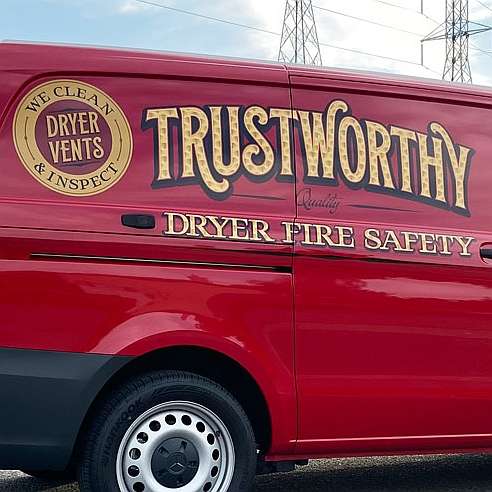
Designing cool signs—make that “effective cool signs”—has always been the draw for Phillip Newell. He’s spent the last 20-plus years creating signs and… Read More
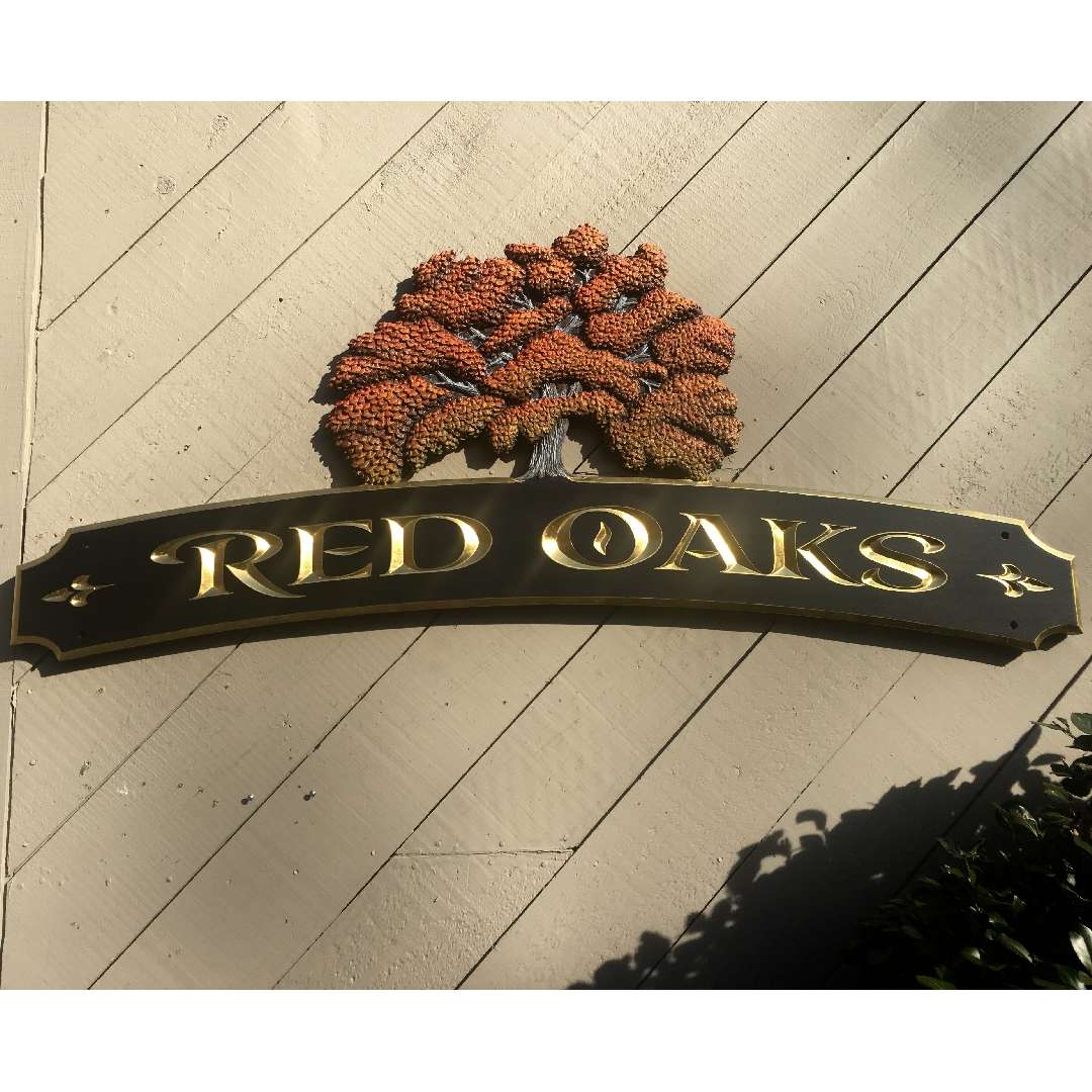
Not every sign advertises a business, announces a sale or tells folks where to park. Some are nameplates for a residence, be it… Read More
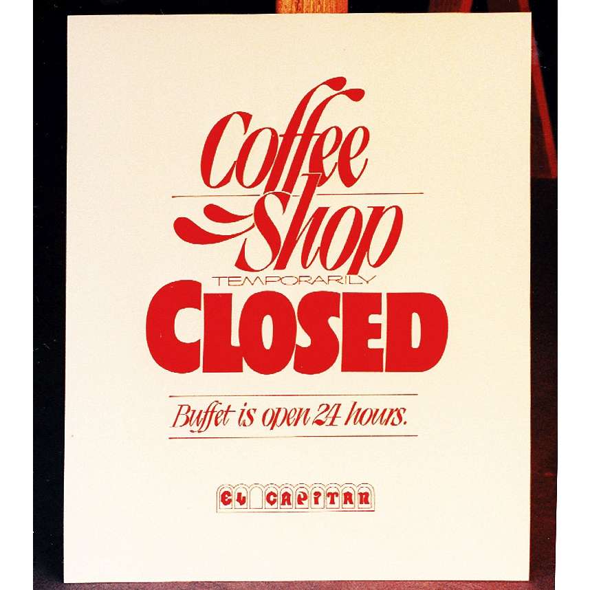
Lane Walker [Solo Signs, Reno, Nevada] lettered this showcard decades ago, but it’s a classic example of the beauty of simplicity—a one-color sign… Read More
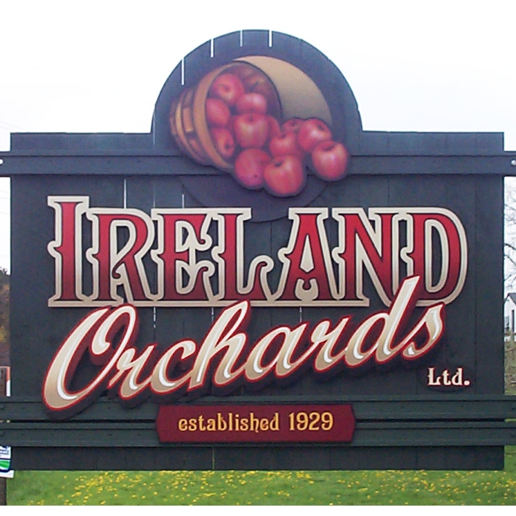
One way to create a unified design is to let the elements bump or overlap each other. Sometimes it is simply the tail… Read More

Transparencies can be an easy way to sneak a logo or graphic into a sign without adding too much clutter—fish or coral for… Read More

One way to increase the mass and overall visual impression of a sign is to mount it on columns instead of posts. A… Read More

The code words for this are “negative space.” It refers to the space around each letter, each word, each message group and the… Read More

When Rob Cooper left Miami for his native New Zealand (and ultimately to Thailand) around 2000, he had to travel light. One of… Read More

One of the tools Bob Behounek uses in his great-looking sign designs is the color wheel. It’s essential to a good understanding of… Read More

3D letters can add a lot to a sign, but a carved graphic or better yet, an actual sculpture, can really make a… Read More
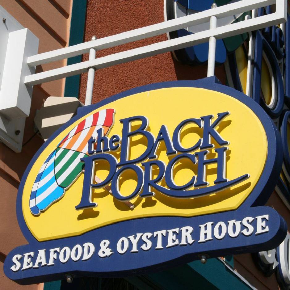
PVC board is a great material for sign making—for letters, sign panels, cabinets and even monument structures. It’s durable, easy to work with… Read More
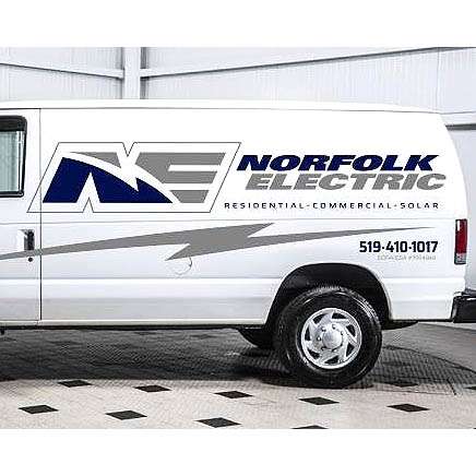
Many customers choose a generic name for their businesses, but by the time they arrive at your shop, it’s too late to suggest… Read More

